Packaging Design: Tampax Redesign (Fictional)
Feminine Products tend to have the same outdated packaging. As a passion project, I redesigned the Tampax boxes to bring a level of sophistication and fun to something many young girls find embarrassing to bring to the register for the first time.
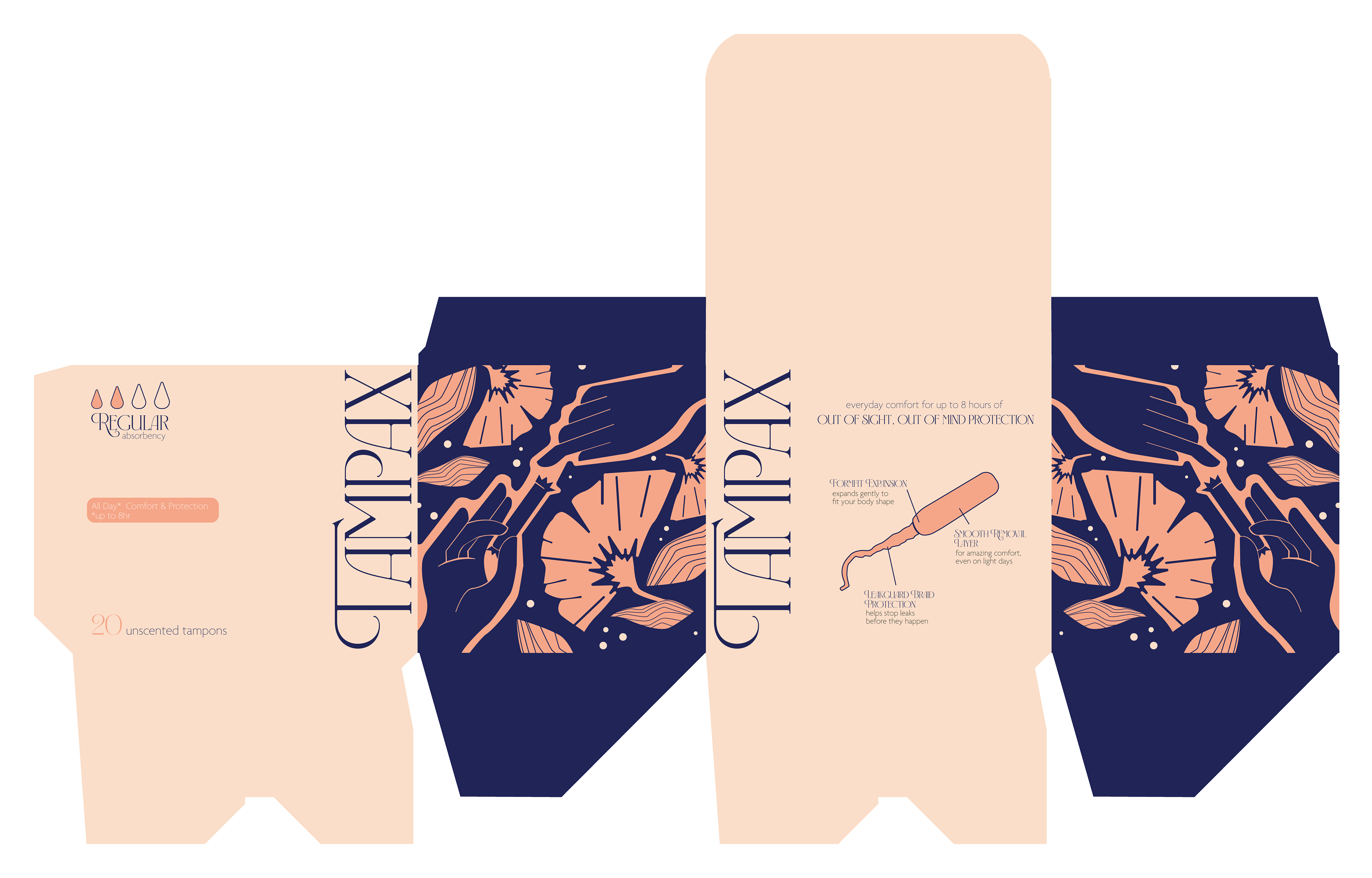
Illustration:
When considering an illustration for this packaging I was inspired by the community among menstruating people. If you're ever in need of a tampon, strangers are usually quick to offer you one. In this illustration, by utilizing color blocking, bold and feminine colors, I was able to represent this generosity & community. Sharing a tampon.

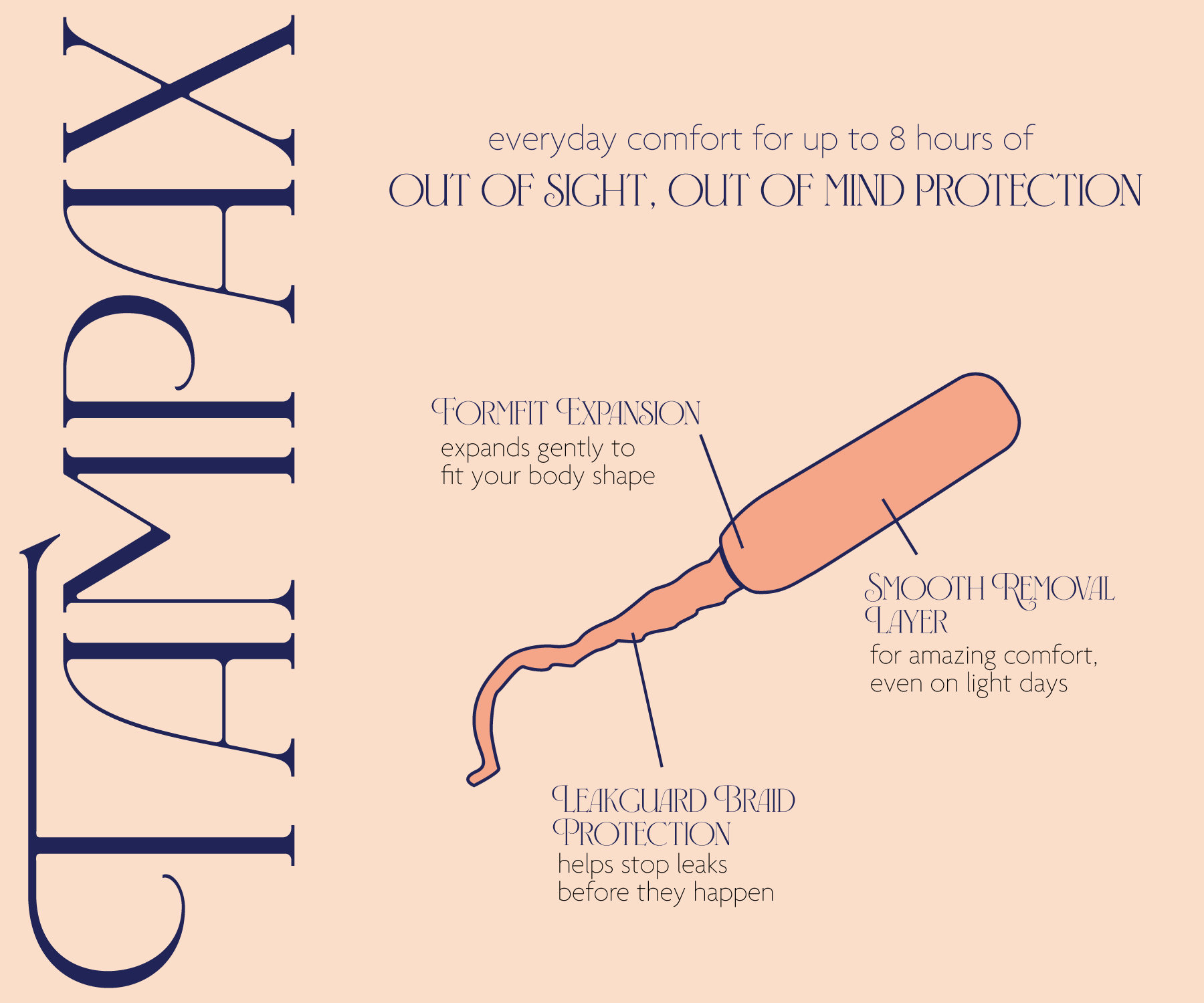
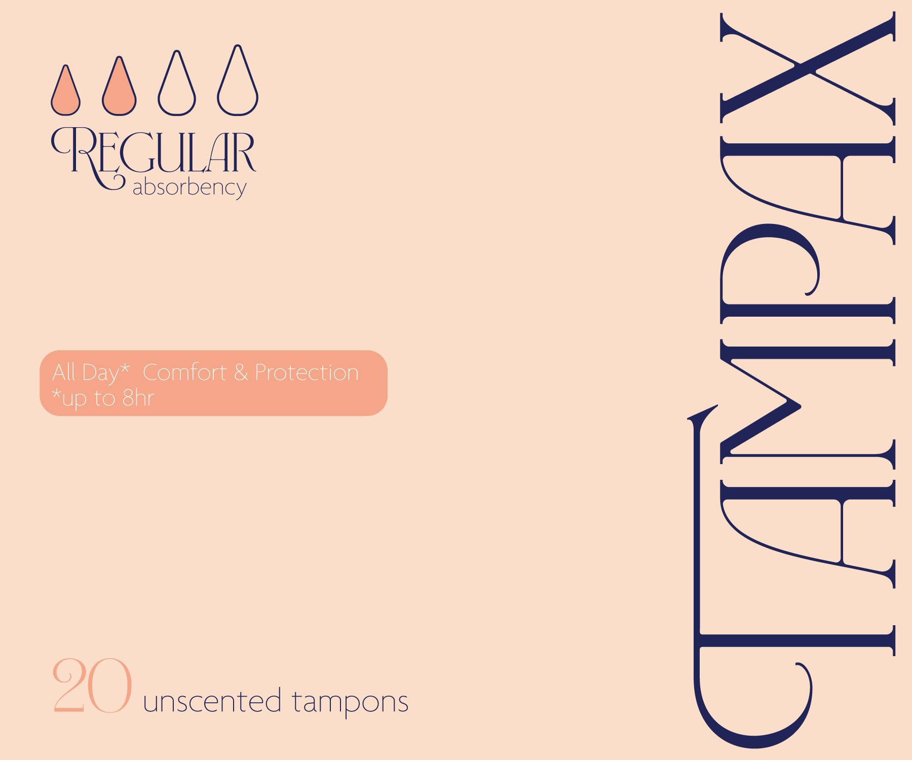
Box Layout Design:
The whole point of this passion project was to design a box that 14 year old me would feel comfortable bringing to the register without feeling embarrassed in the slightest. Feminine Products are notorious for being flashy and "in your face". I wanted to break that mold by creating something minimalistic and clean, while also representing femininity and community!