Full Rebrand: Hannah Bird Photography
Complete with new logo, branding guidelines, custom illustrations, & a website.

Logo Mark & Variations:
When creating a logo we wanted an original mark that wasn't "stereotypical" for a photographer. After exploring several dozen concepts we landed on this minimalistic, typography inspired original mark. This logo combines Hannah's Initials in a single icon.
From here it was all about discovering clever ways to organize and put together the different logo variations. These work perfectly as overlays for social media posts and promotional posters.


Color Palette & Typography Choices:
A few core values Hannah wanted expressed through her Brand Identity were: Authenticity, Elegance, Warmth, & Community. By utilizing color psychology I was able to create a custom color palette that expressed these core values well. Also by integrating some bold serif typography with a thin san serif... it was able to add a nice balance between "Adventure" & "Elegance".
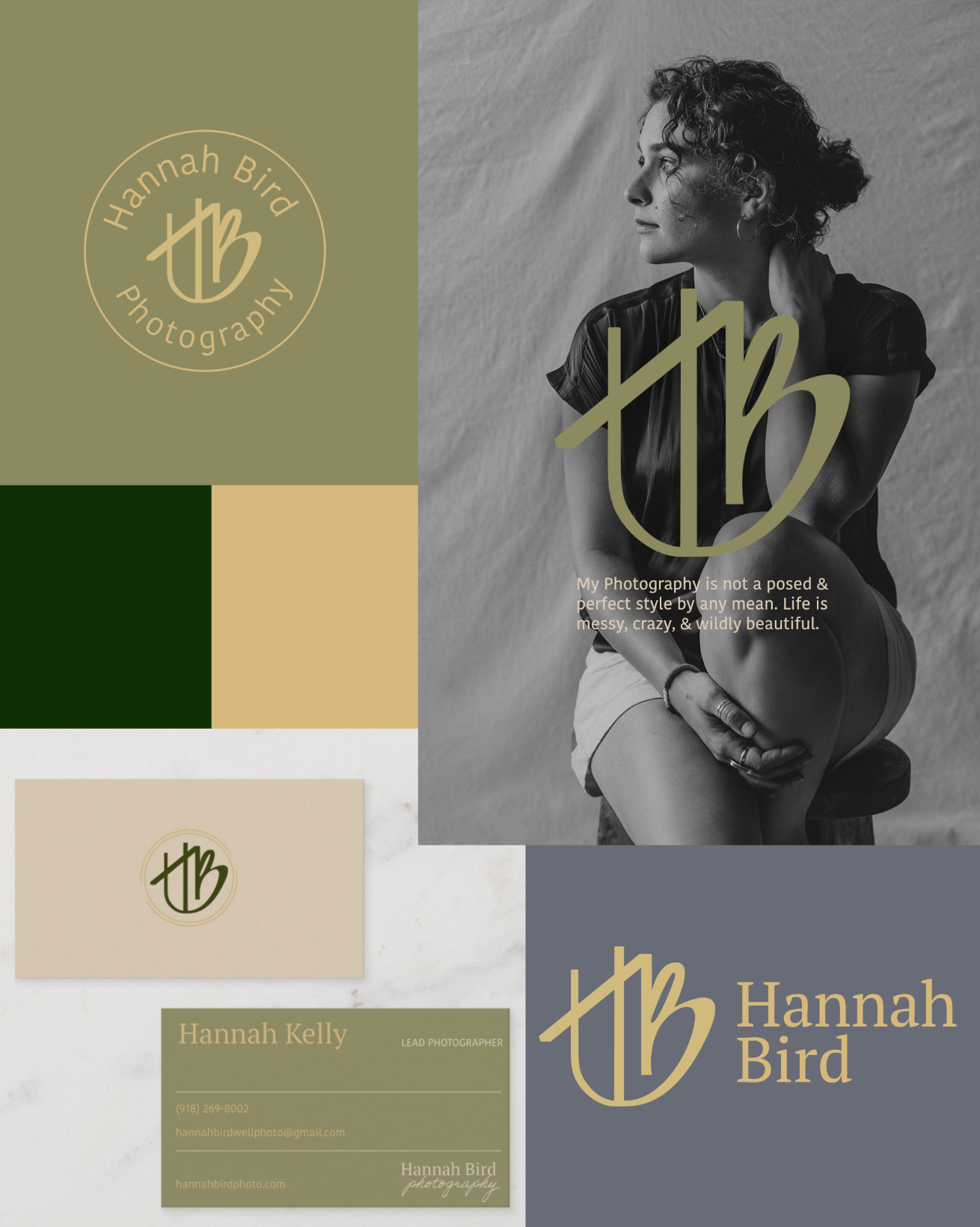
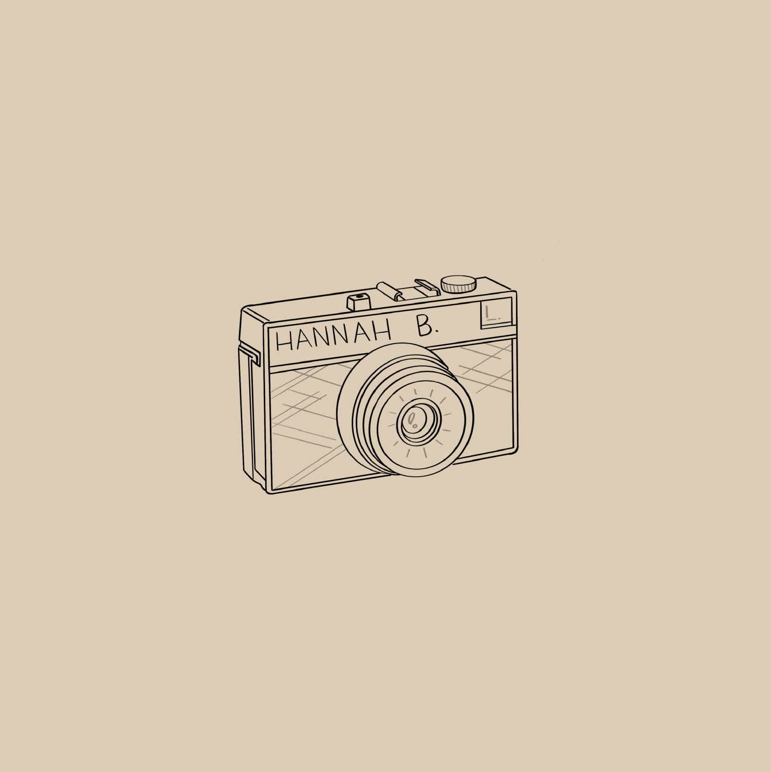
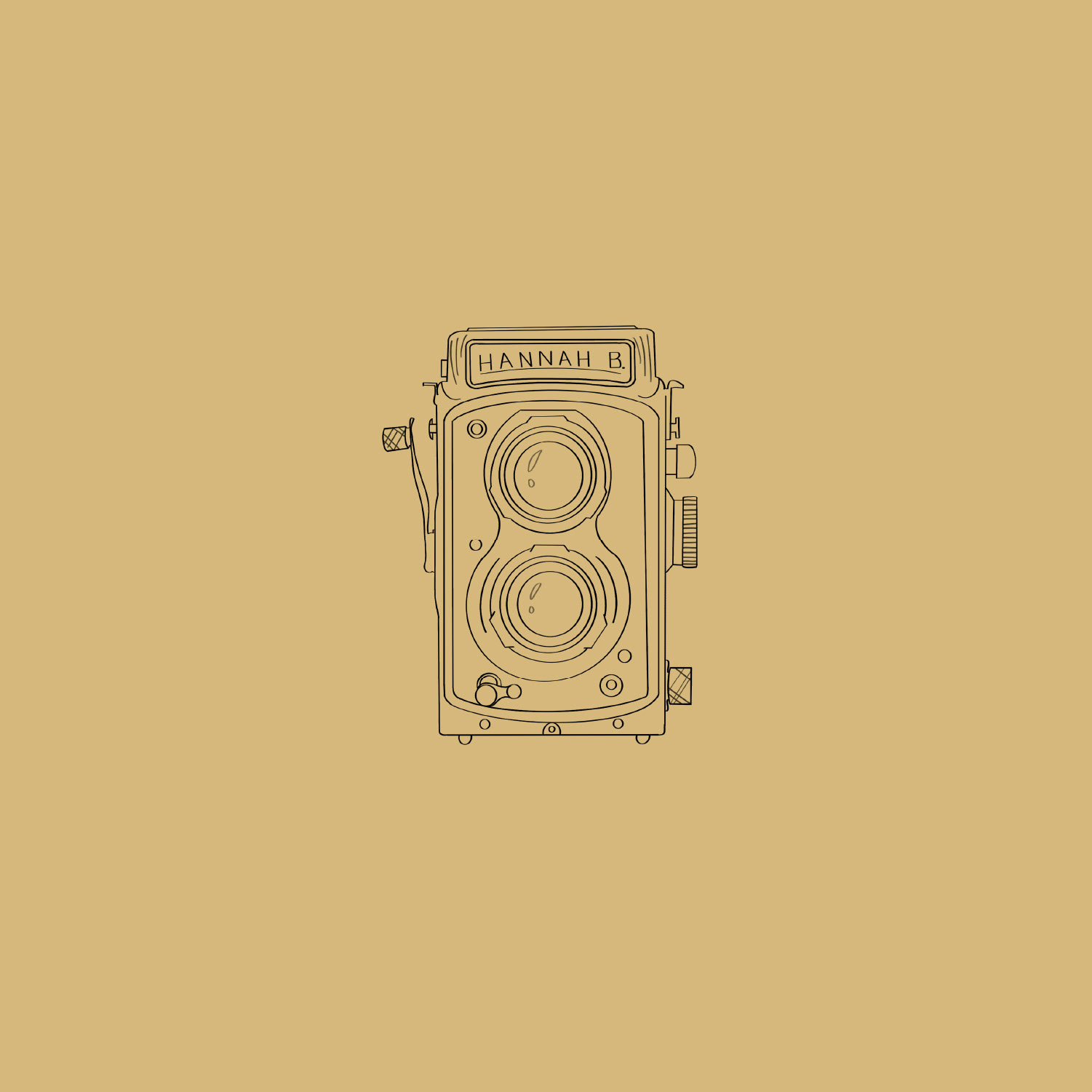
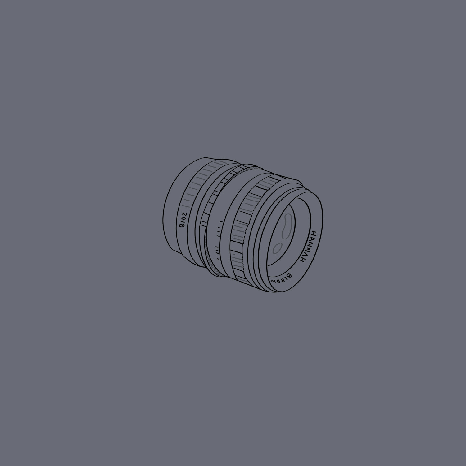
Custom Illustrations:
Social Media presence for a freelance photographer is vital. I wanted Hannah to be prepared with several custom hand drawn graphics she could utilize within her Instagram feed. I also provided a color palette and projected theme to reference while posting future content.


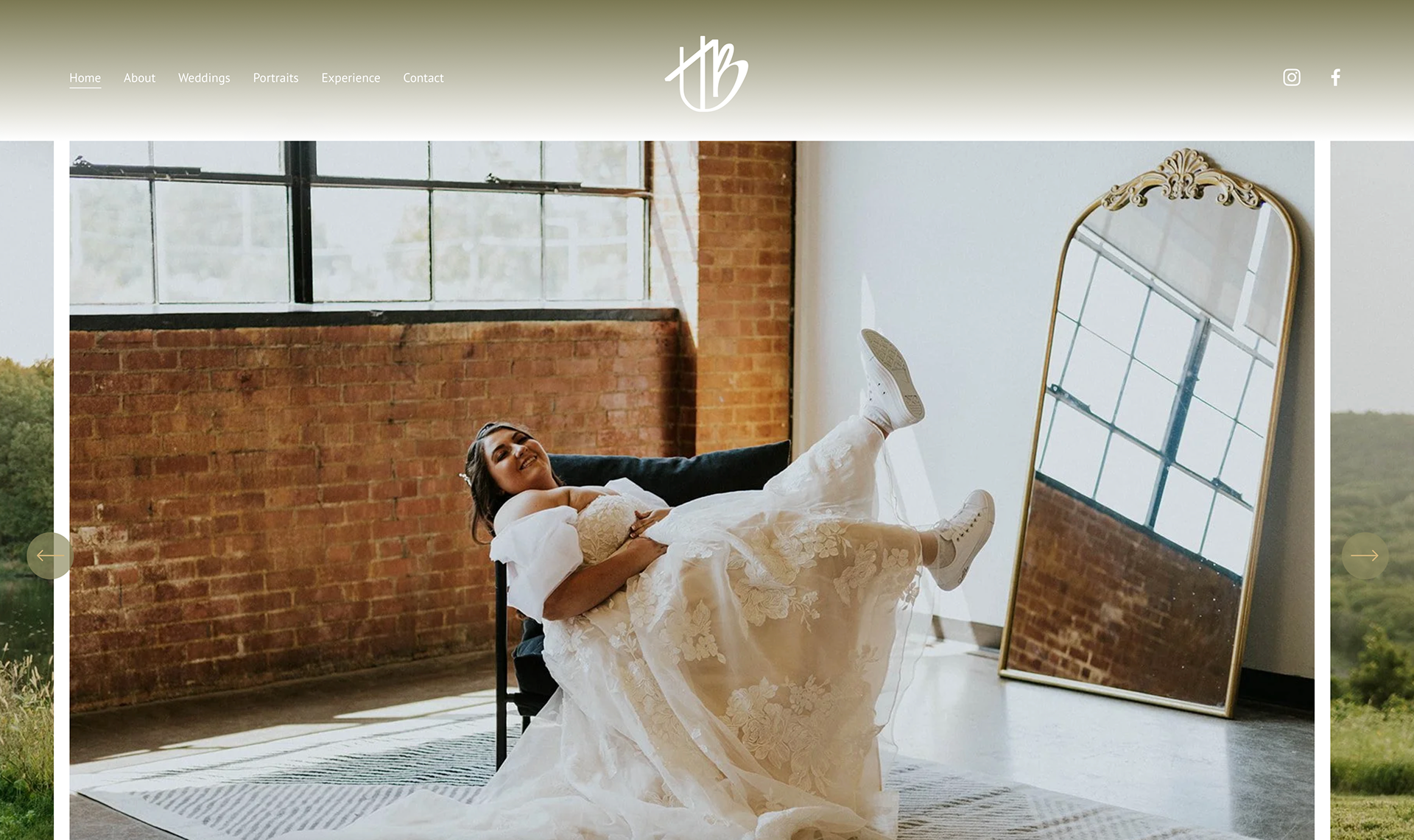
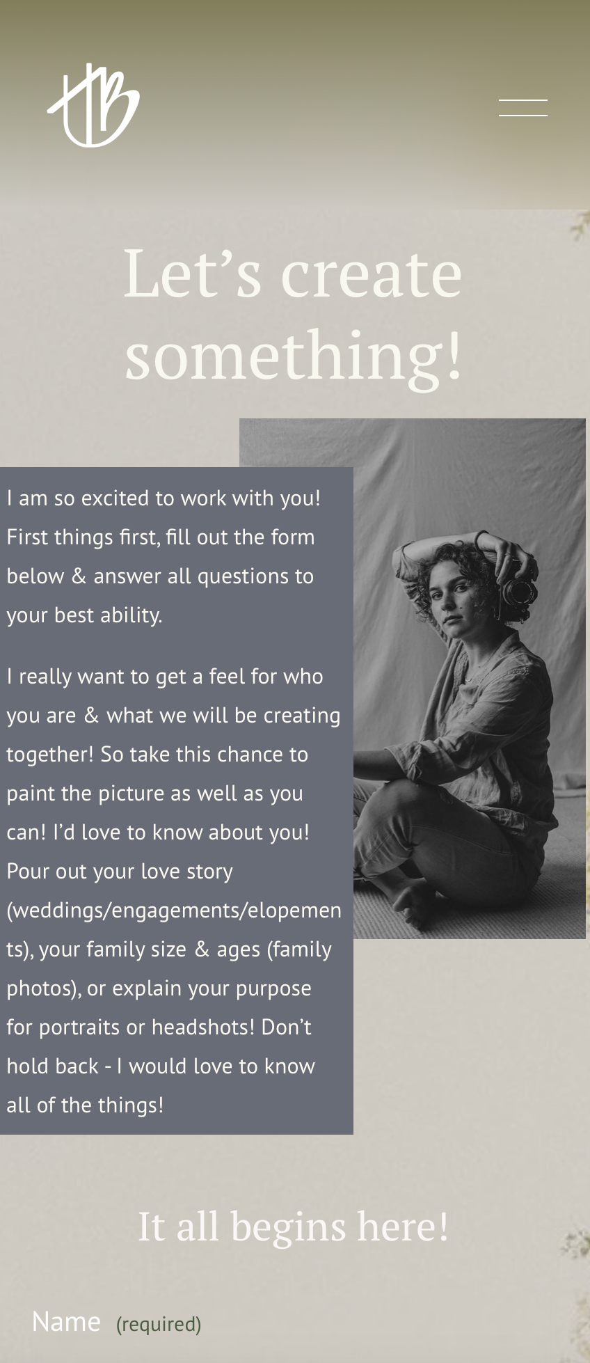
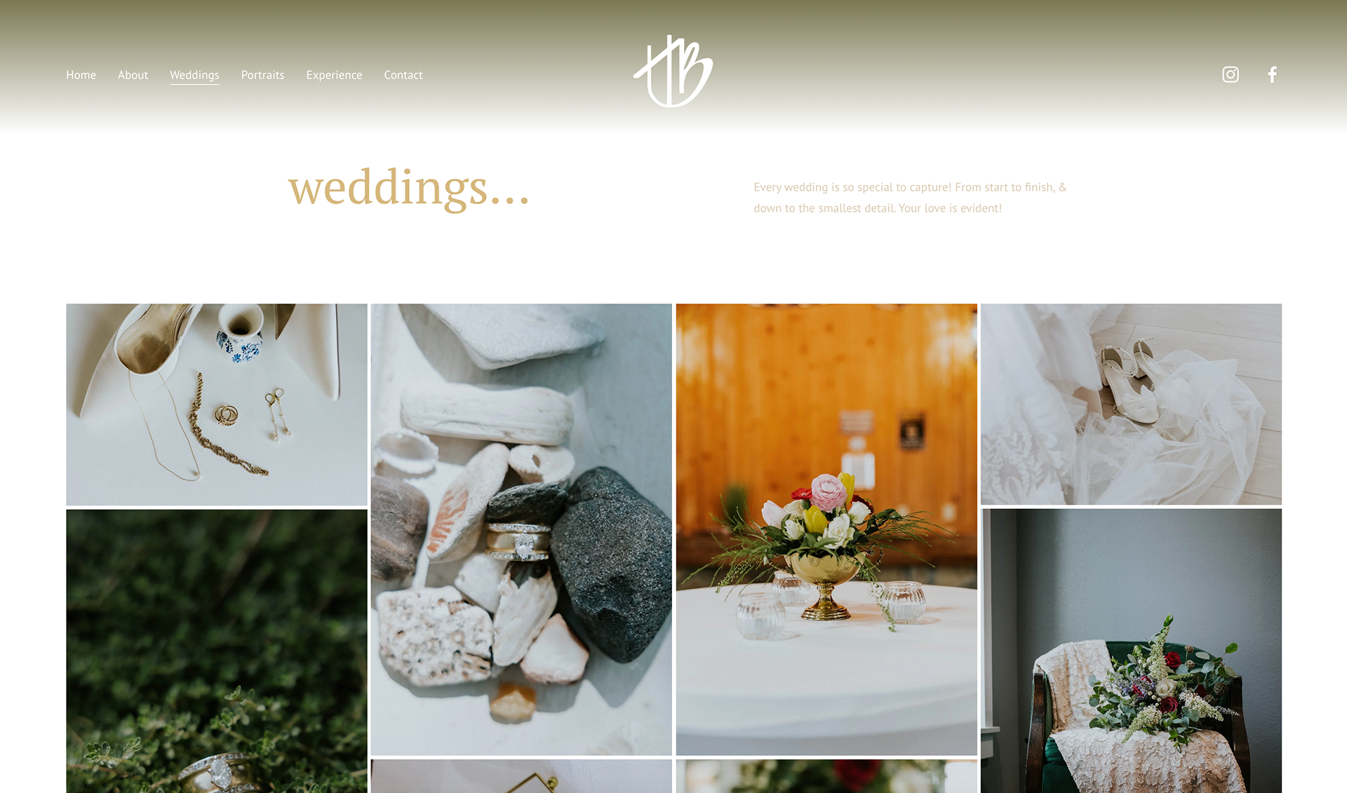
Website Design:
When thinking about her website, we wanted to showcase more than just her photography. I wanted to create a direct reflection of Hannah herself. I utilized her color palette in its entirety to relay a deep sense of emotional depth, as well as consistency within her brand. We both felt it important that we allowed the photography to speak for itself while also creating an experience for the viewer.
Interact with the website here: