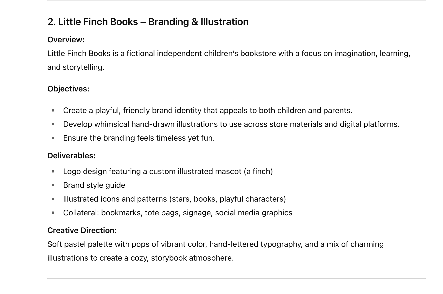
The Creative Process behind "Little Finch Bookstore" project...
Project Brief:
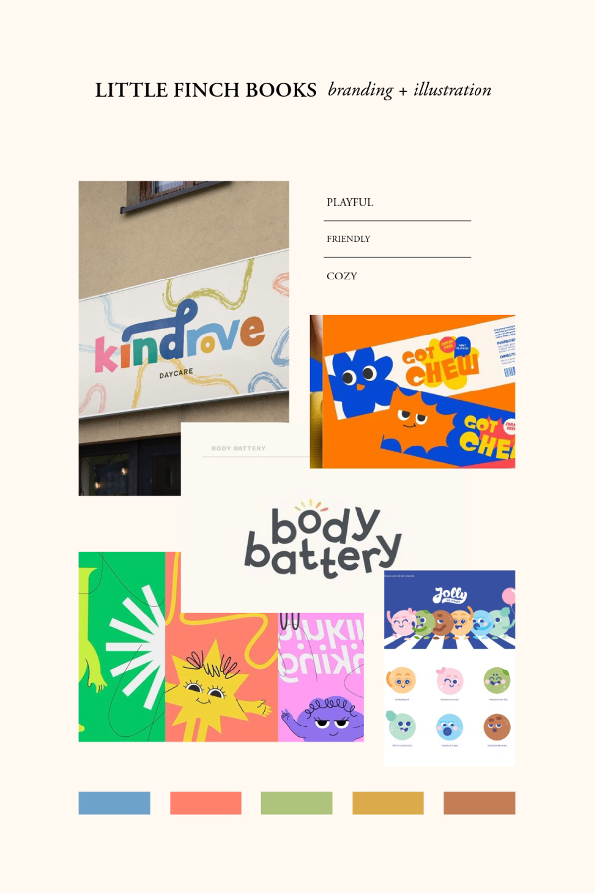
From here... comes a mood-board: this direction is highlighting different brands full of color, illustrations, and playful designs.
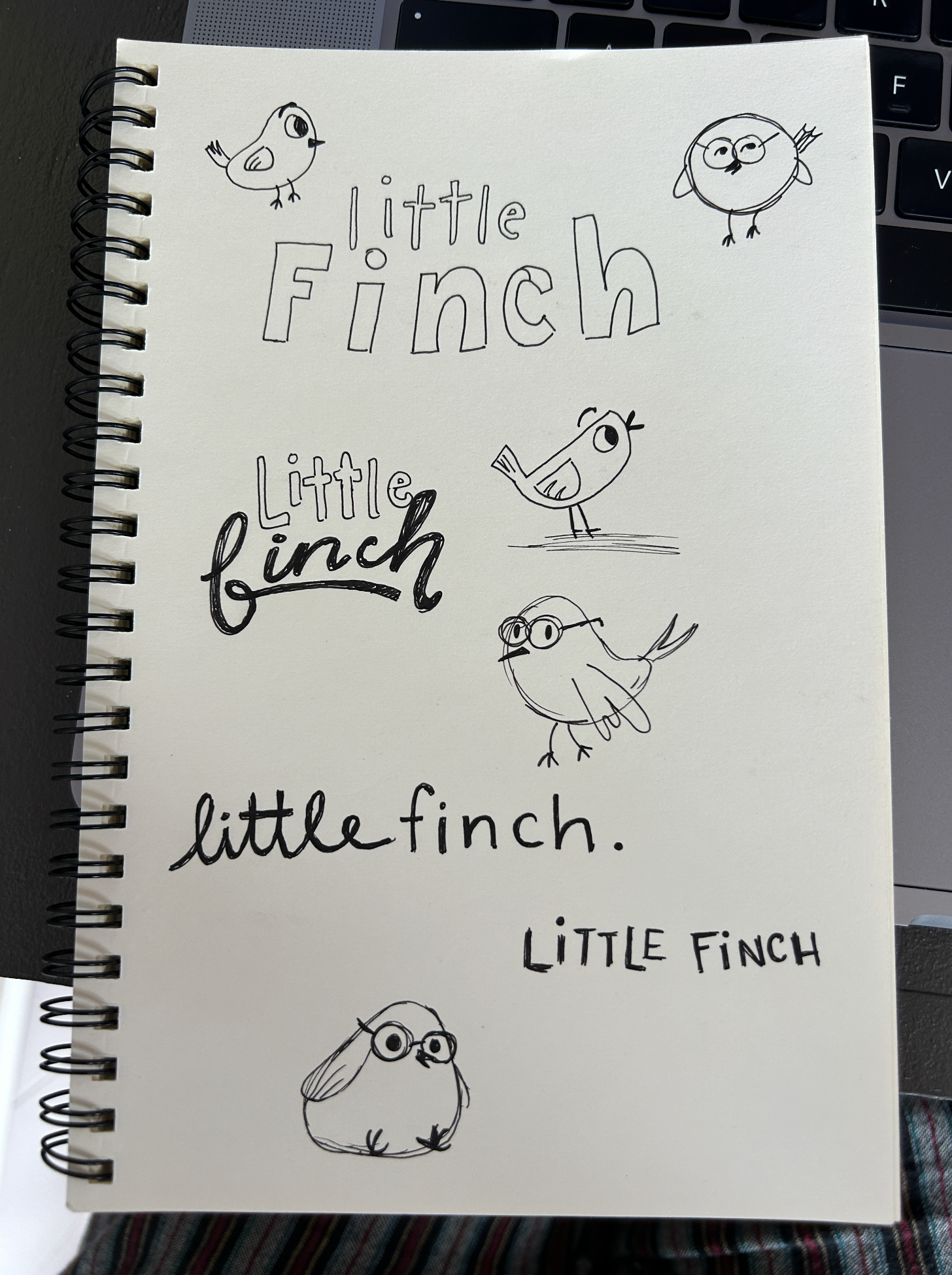
We then hit "Discovery". Here is where we explore every possible idea. Pen to paper!
(A little snapshot of that process)
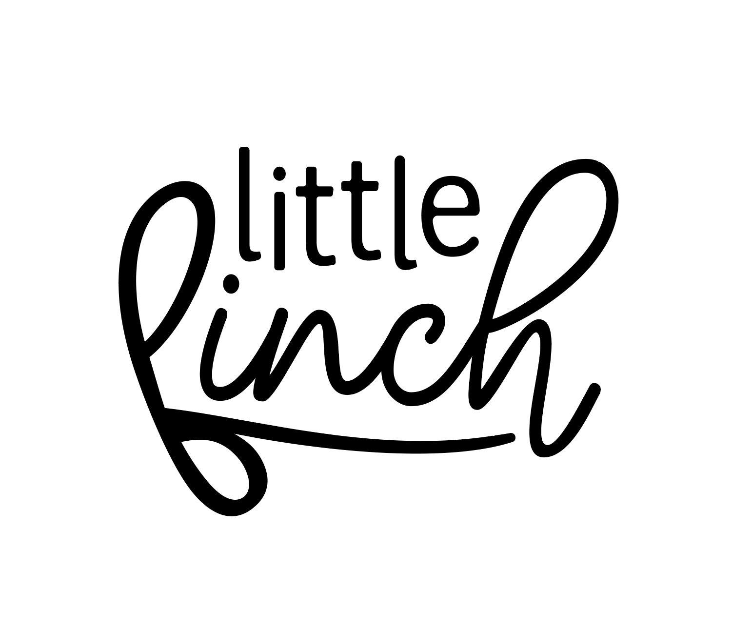
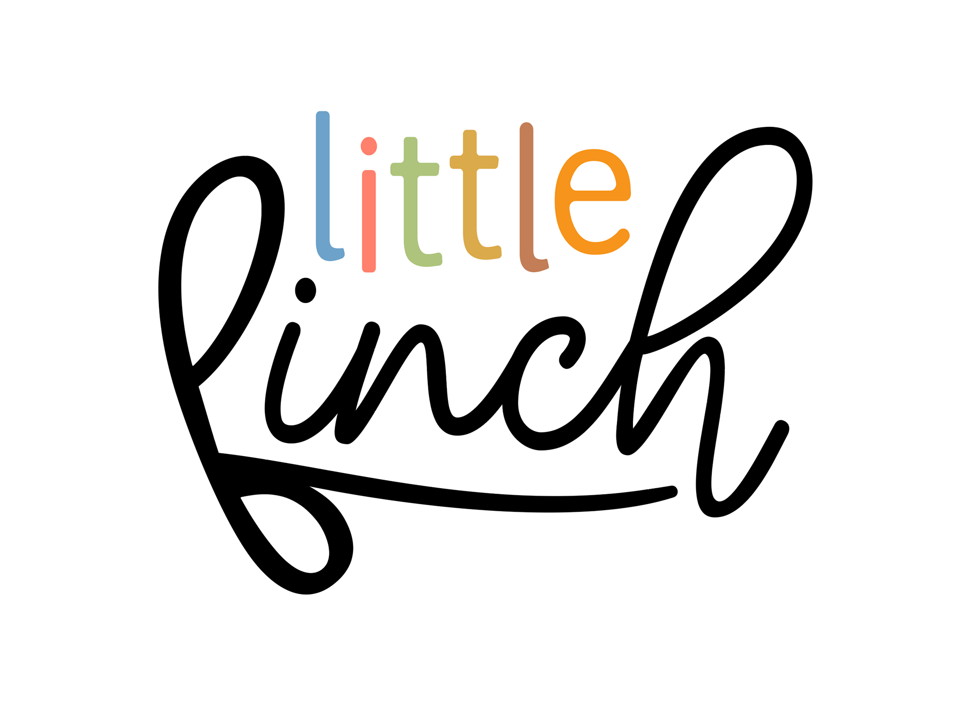
Digital Time...
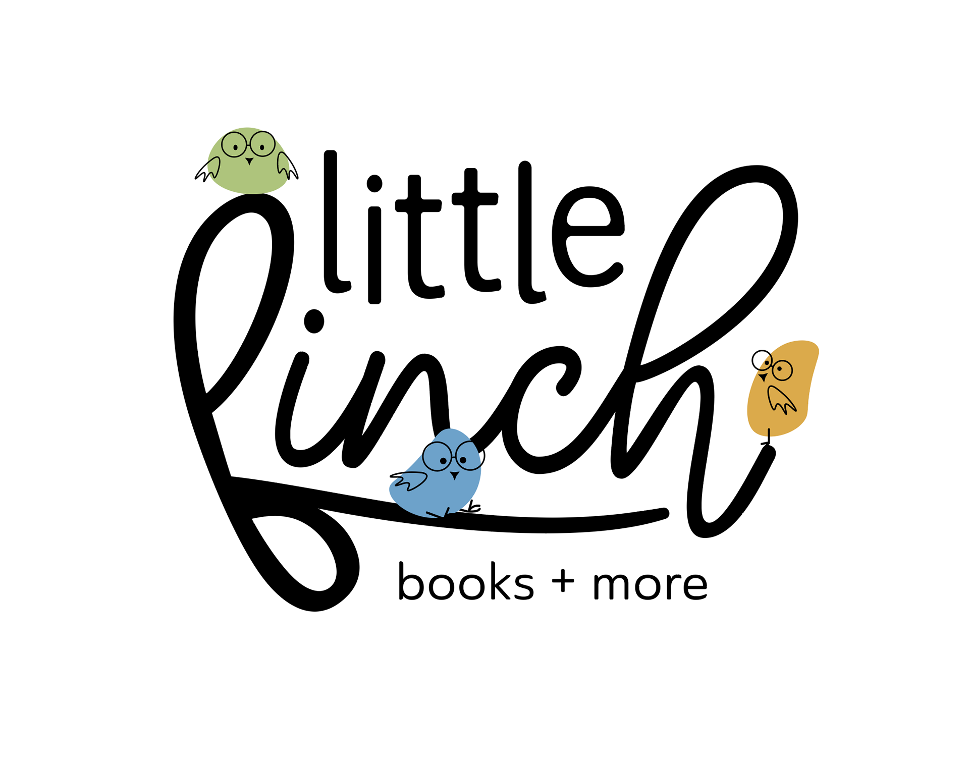
This is when I was able to truly clean up the lines and direction of this branding. But integrating the color palette I feel that this logo truly came alive and directed the following branding assets.
Illustrations?
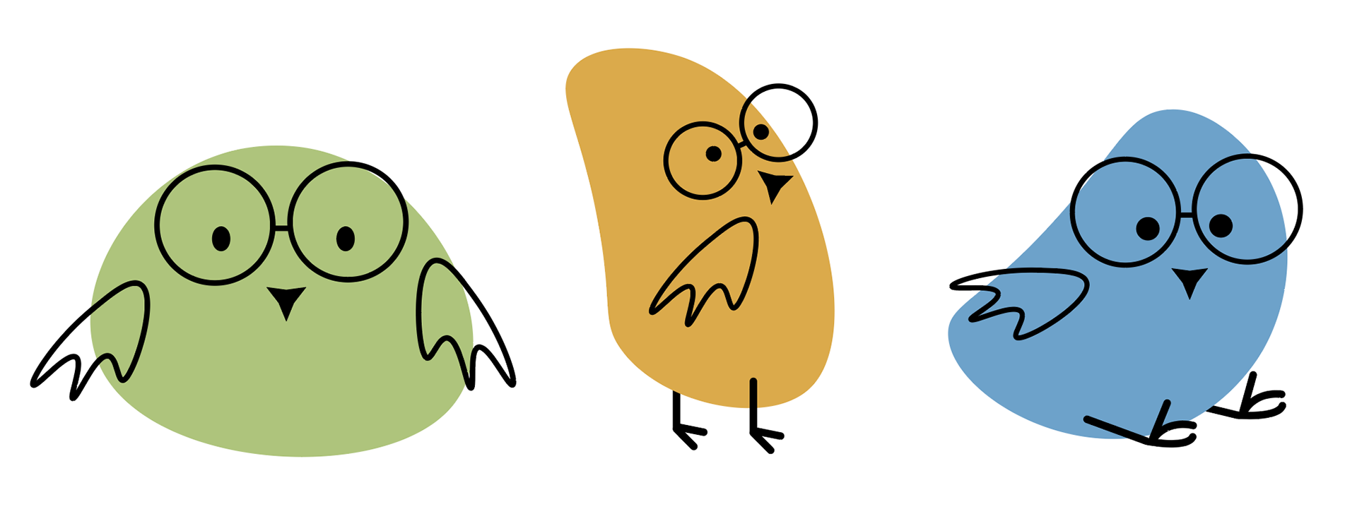
Obviously with a name like "Little Finch", the clear direction was to incorporate bird illustration mascots! These fun little mascots are vector based organic shapes. By integrating the glasses and wings, they truly came alive and took on these fun characters!
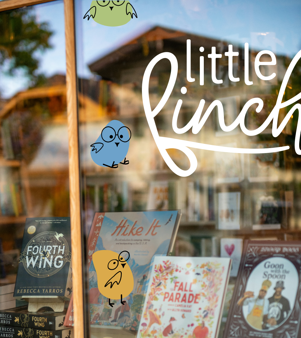
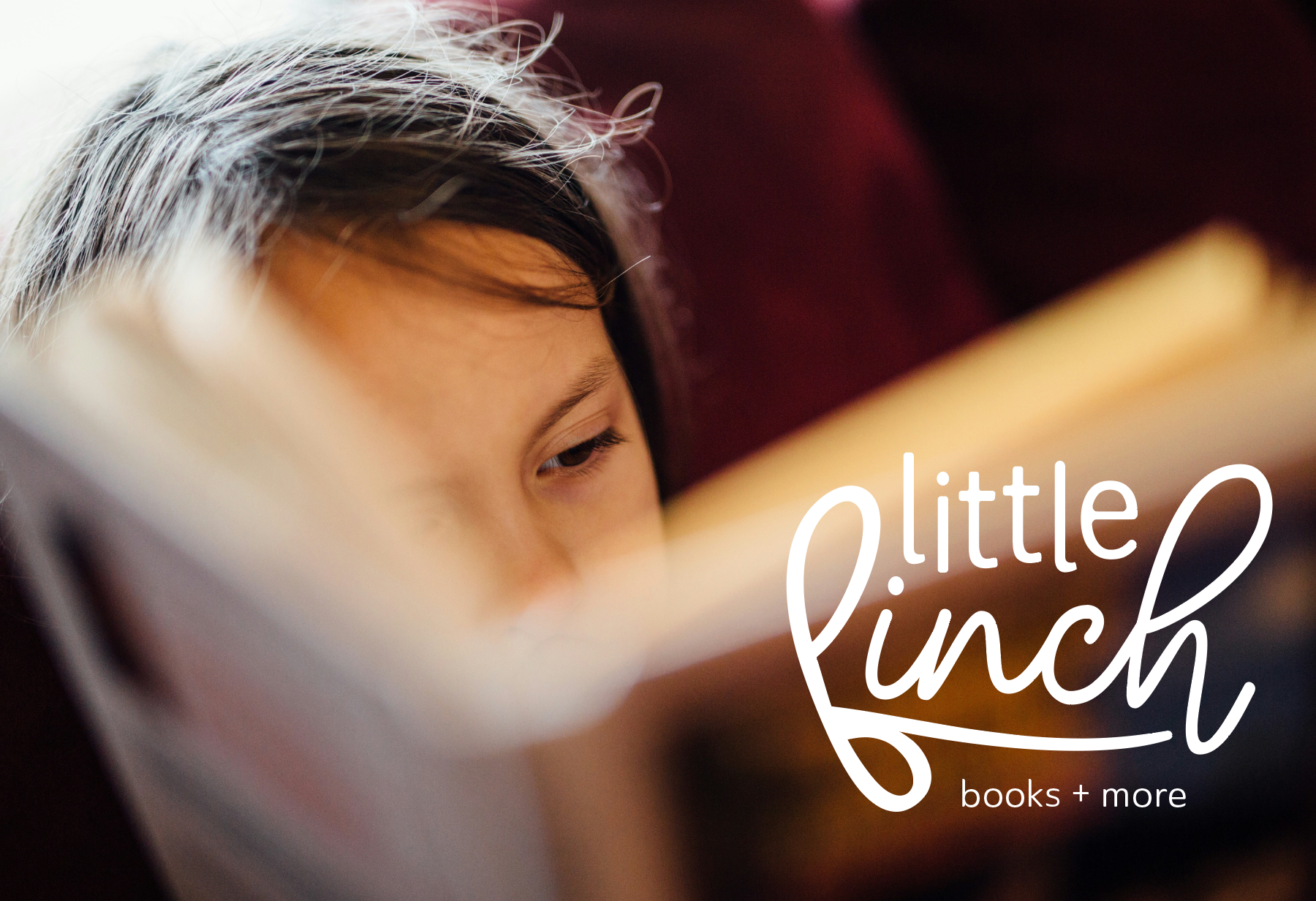
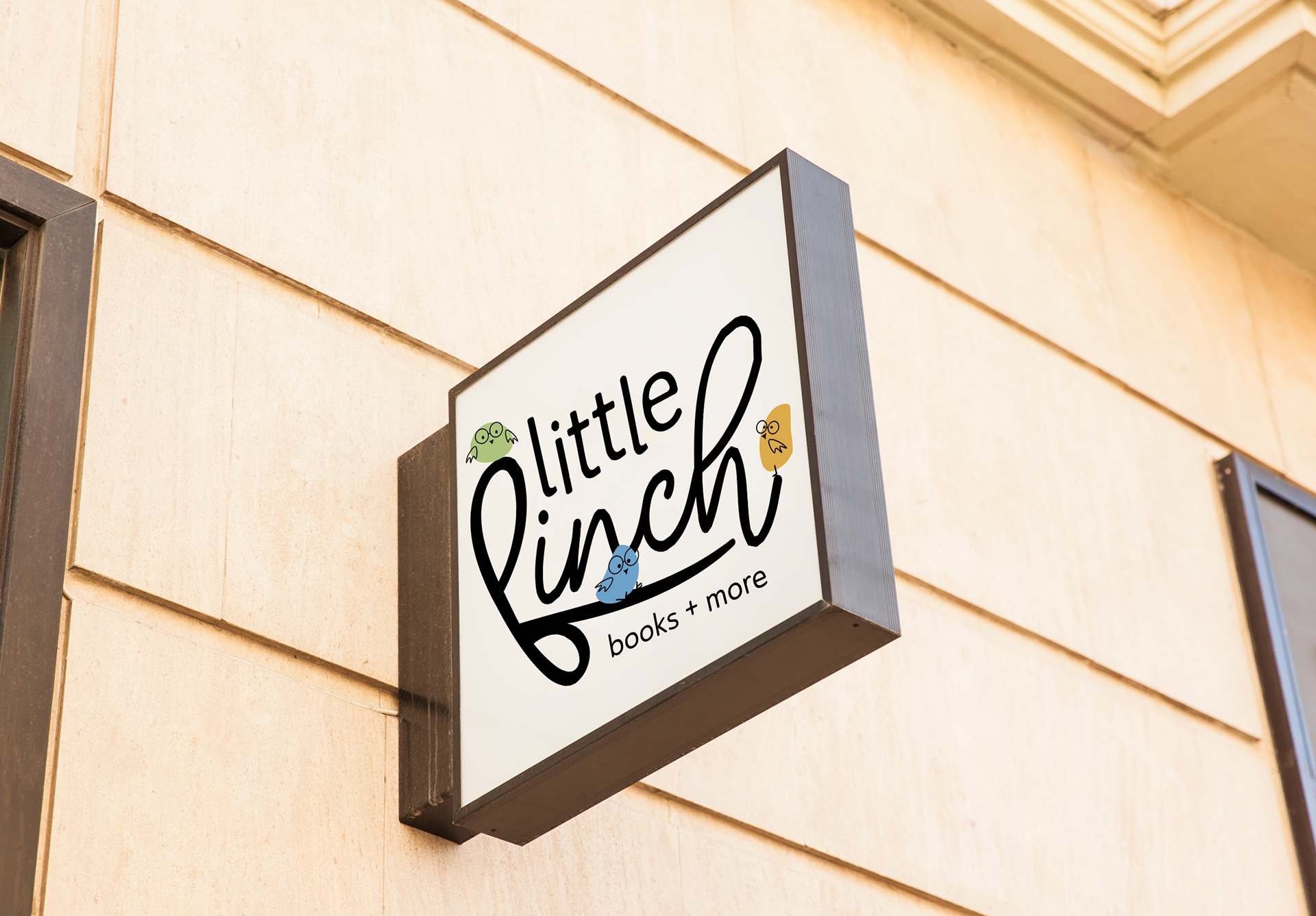
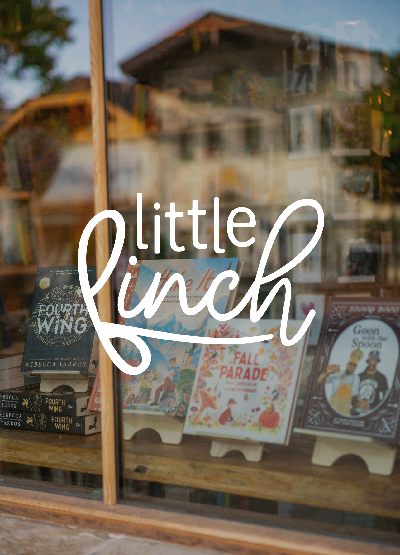
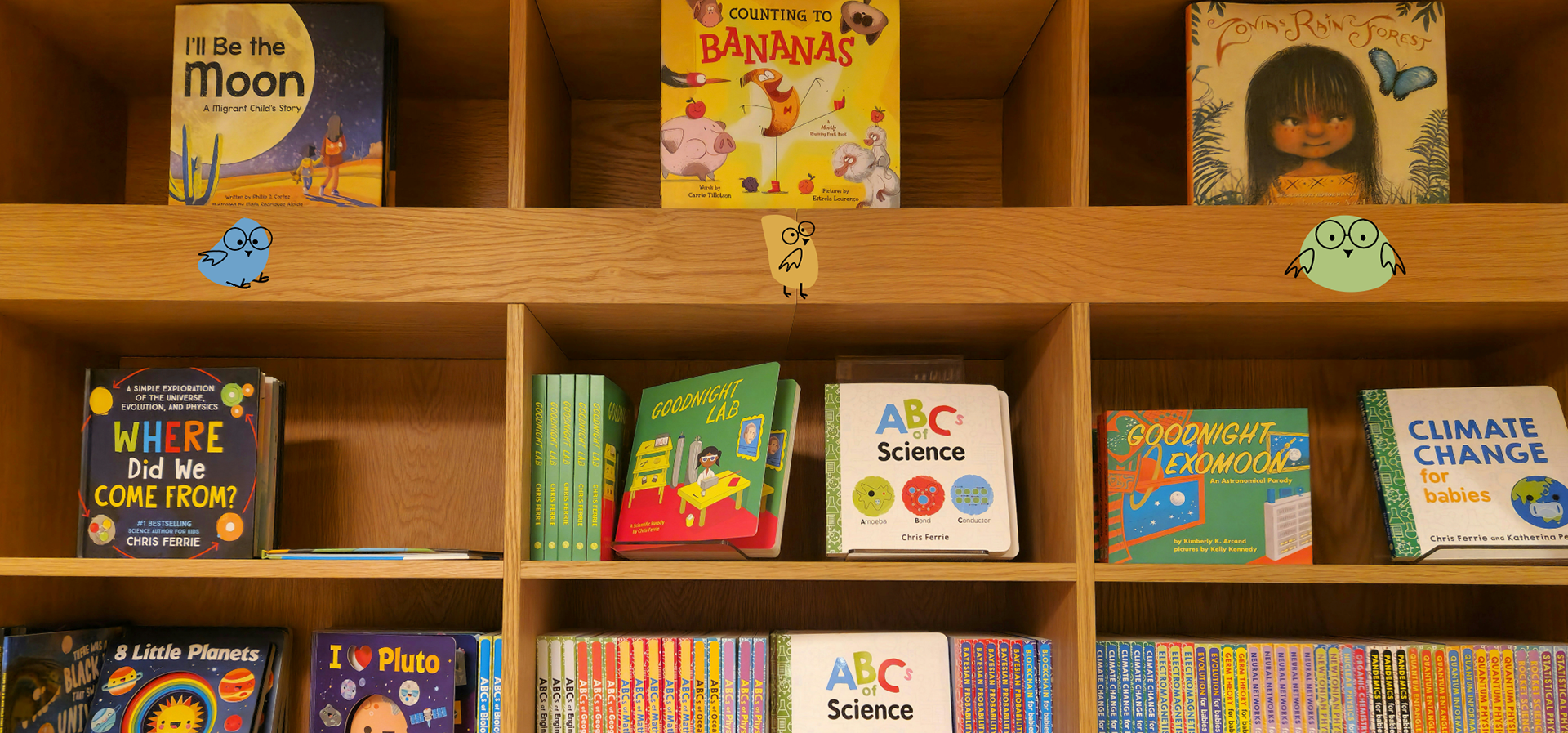
... a little potential window art moment?